Want to buy or sell something? Check the classifieds
  • The Fedora Lounge is supported in part by commission earning affiliate links sitewide. Please support us by using them. You may learn more here.

Simonds Caps

Status
Not open for further replies.

BR Gordon

One Too Many
Messages
1,152
Location
New Mexico
If you were to make the H a larger, match the size of the C as FFF said, and spaced more normally in the Hinterland. I think that you would get the HC look, that I believe you were looking for.
 

Johnny J

Call Me a Cab
Messages
2,115
Location
Panama City, Florida
I like the third one, clean and simple. Maybe I would change the outside frame and use a different one. I think mine should have been more simple like yours making it have a more vintage style look.
 

The Wiser Hatter

I'll Lock Up
Messages
4,765
Location
Louisville, Ky
I have several vintage fonts that I use in Adobe illustrator to make logos like this. Will fire up Illustrator an come up with some ideas.


Sent from my iPhone using Tapatalk 2
 

Two Types

I'll Lock Up
Messages
5,456
Location
London, UK
I rather like the first design. I agree that the font needs to be bolder, so that it jumps out at you.

I also think that 'Hinterland Caps' might work better than 'The Hinterland Cap'. The former sounds like a brand, the latter sounds like a style.

I think 'Hinterland Caps' would sound good then you could have a name for the cap styles you offer - such as the 'V Back' by Hinterland Caps.
 

herringbonekid

I'll Lock Up
Messages
6,016
Location
East Sussex, England
Simonds, to me they look more like movie title cards than logos. i think that's probably because there's a lot of empty space between the lettering and the border.
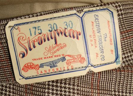
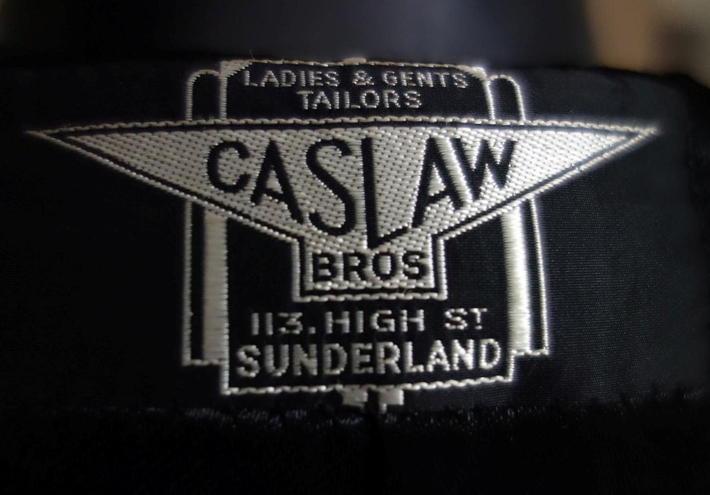
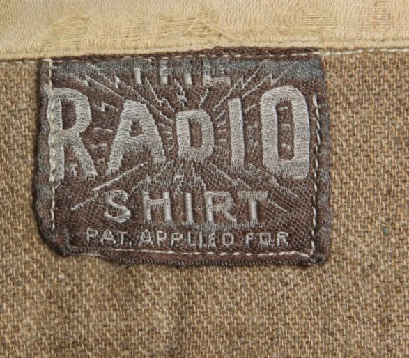
art deco clothing logos tend to be quite compact and 'full'. also, if you can incorporate a drawing or other graphic shape too, so much the better. here's three i think really work:

30strouserlabel_zps8f3510e5.jpg


sunderland_zps65813d9e.jpg


radio_zps5cfa2720.jpeg
 

Two Types

I'll Lock Up
Messages
5,456
Location
London, UK
HBK: As I started to read your post i immediately thought of the Caslaw logo and then, lo and behold, I scroll down to find it there. I think it is a wonderfully simple piece of art that is so perfectly of its time.
 

howardeye

Practically Family
Messages
569
Location
NW Indiana
I got an ancient Indigo Blue feather bed cover coming in the mail. The lady that had this has some from the late 1800's in a different pattern. How would this look as a cap?

790E116B-97F2-4398-A0EC-3C5B2DB99ABA-668-0000006C8B14B5FE_zps8a8d7bb6.jpg

The fabric came in the mail today. It is a very nice piece and a little heavier than the Hickory Stripe. I will be sending it your way. Thanks
 

Two Types

I'll Lock Up
Messages
5,456
Location
London, UK
Are you set on the name? Why not just stick with 'Simonds Caps'?

I would also think about the font. My concern over fancy fonts is that they are not always instantly readable.

My personal taste would be for something bold and very 1930s. The 'Caslaw' label posted by HBK is so utterly beautiful, and yet simple, that it can't be beaten.
 
Status
Not open for further replies.

Forum statistics

Threads
109,328
Messages
3,078,974
Members
54,243
Latest member
seeldoger47
Top