Johnny J
Call Me a Cab
- Messages
- 2,120
- Location
- Panama City, Florida
How about something like this:


")
TT looks great like the font...
Here is another one that we really like.

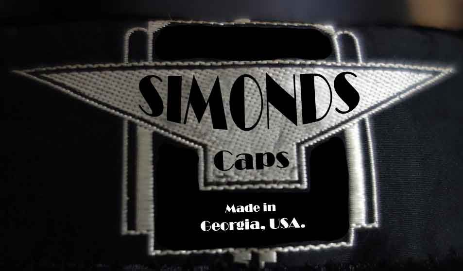
I'm no designer, but here's a quick rip-off of my favourite 'Caslaw' logo. Very simple. East to read. Would look better with the same font as the original design, but i didn't have that.
TT looks great like the font...
Here is another one that we really like.


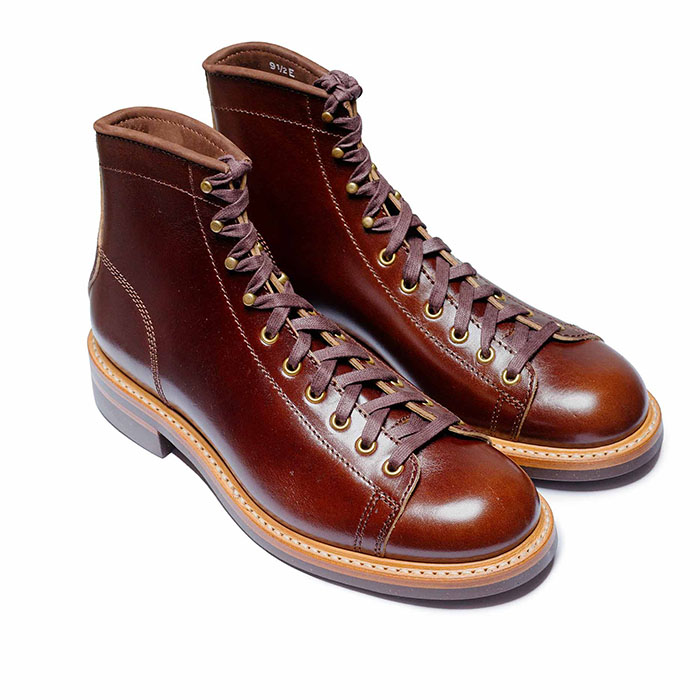 John Lofgren Monkey Boots Shinki Horsebuttt - $1,136 The classic monkey boot silhouette in an incredibly rich Shinki russet horse leather.
 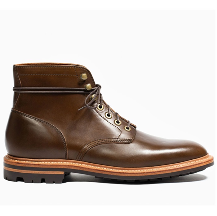 Grant Stone Diesel Boot Dark Olive Chromexcel - $395 Goodyear welted, Horween Chromexcel, classic good looks.
 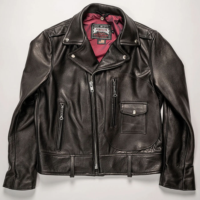 Schott 568 Vandals Jacket - $1,250 The classic Perfecto motorcycle jacket, in a very special limited-edition Schott double rider style.
 Wiser Hatter, i'm not feeling it. it doesn't come across as vintage enough. if you plan on using a diamond then it's the perfect opportunity to warp the text to fit into the diamond shape.
I had used a vintage logo to make this one. But if you want warp text then I can do that too.

