Want to buy or sell something? Check the classifieds
  • The Fedora Lounge is supported in part by commission earning affiliate links sitewide. Please support us by using them. You may learn more here.

Show us your vintage home!

Messages
15,259
Location
Arlington, Virginia
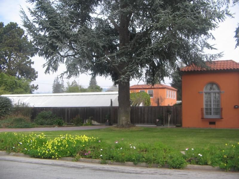
Ok but you really owe me for looking at that crap for as long as I had to:
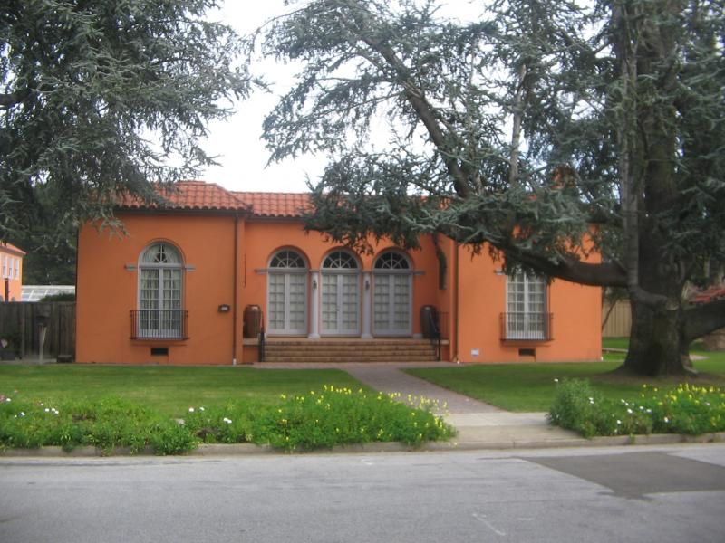
IMG_2233_zpsaab43c62.jpg

Full frontal
IMG_2234_zps3d8f8e0c.jpg

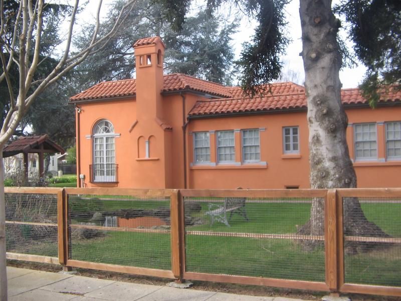
They even painted the poor butler and Maid's quarters that horrible combination.(you see the building on the left)

The side near the cement pond::p
IMG_2232_zpsabf7e21a.jpg

You live next door to THAT??!! :doh: :puke: :faint:
 

vitanola

I'll Lock Up
Messages
4,254
Location
Gopher Prairie, MI
You live next door to THAT??!! :doh: :puke: :faint:

This color scheme may be inspired by a misunderstanding of a description of a Addison Minzer scheme from the '20's, which described "a buff stucco with undertones of ochre, and a soft, greyed trim on the wood-work, giving the appearance of a house of a hundred summers." Of course, that house was intended to stand in a grove of cypress, not out in the open.

Now, there is certainly a lot of ochre in that ground color. Far too much, of course, and so there is little of the necessary contrast with the red tile of the roof. The grey trim would work, we're it applied artistically, with streaks of dark and highlights of natural wood color. The unfortunate shade used here is just a particularly unappetizing shade of battleship grey. BLECH!

Now of course, this house is taking no account of its surroundings. Just as a cottage in a wood should be sheathed in shades of green and brown a stucco manse in California should reflect sea and sun and sky. I could picture this house looking perfectly charming in a shade of a warm buff with yellow undertones, and the wooden window trim painted either a rich brown or the deep green of aged bronze. I think that the home would then be an ornament to the neighborhood.

BTW, was that house designed by the office of Bernard Maybeck?
 

Stearmen

I'll Lock Up
Messages
7,202
Fun, tracing some old knob & Tube tonight. Finally figured out where it is going with a tracer. Of course, there is no obvious easy rout for new Romex. Oh well, I will figure it out, always do. Had a pleasant shock today, I received the county Tax bill for the house, it is lower then my current house, even though it is worth probably twice as much. Go figure!
 
This color scheme may be inspired by a misunderstanding of a description of a Addison Minzer scheme from the '20's, which described "a buff stucco with undertones of ochre, and a soft, greyed trim on the wood-work, giving the appearance of a house of a hundred summers." Of course, that house was intended to stand in a grove of cypress, not out in the open.

Now, there is certainly a lot of ochre in that ground color. Far too much, of course, and so there is little of the necessary contrast with the red tile of the roof. The grey trim would work, we're it applied artistically, with streaks of dark and highlights of natural wood color. The unfortunate shade used here is just a particularly unappetizing shade of battleship grey. BLECH!

Now of course, this house is taking no account of its surroundings. Just as a cottage in a wood should be sheathed in shades of green and brown a stucco manse in California should reflect sea and sun and sky. I could picture this house looking perfectly charming in a shade of a warm buff with yellow undertones, and the wooden window trim painted either a rich brown or the deep green of aged bronze. I think that the home would then be an ornament to the neighborhood.

BTW, was that house designed by the office of Bernard Maybeck?

Actually it was designed by a Spanish architect in the 1920s for a doctor. One of the old time dentists who had a bottle of whiskey and a pliers as his main tools. :p It is quite beautiful inside but it has been years since I have been inside so they could have screwed that up too for all I know. :doh:

Originally the house was white with a blue or green trim if I remember correctly. It was fine like that and had been since the 1920s---until doofus and doofus bought it. :doh:
 

Stearmen

I'll Lock Up
Messages
7,202
Fun, tracing some old knob & Tube tonight. Finally figured out where it is going with a tracer. Of course, there is no obvious easy rout for new Romex. Oh well, I will figure it out, always do. Had a pleasant shock today, I received the county Tax bill for the house, it is lower then my current house, even though it is worth probably twice as much. Go figure!

Managed to run one fish tape, so should be able to pull the wire tomorrow. Manged to put a rusty nail in my thumb. Bandaids, I keep forgetting to bring some! Oh well, electrical tape works just as good, maybe even better, with all the gooey residue!
 

vitanola

I'll Lock Up
Messages
4,254
Location
Gopher Prairie, MI

He is suffering alright----from rectal cranial inversion.:doh:
And green would still be ugly.:p


I suppose you'd paint these houses a nice, safe, white or beige:

View attachment 23095

greene_greene_house_08.jpg

pasadena-architecture-bungalow-heaven.jpg

fairbank.jpg

None.jpg

historic-paint-colors-barber-villa2.jpg

The danger of choosing a distinctive color scheme is that one can easily go calamitously wrong, whereas white, wheat and beige, though generally boring, often historically inappropriate, and sometimes downright ugly depending upon the architecture of the house and its setting, are seldom if ever thought open to criticism.
 
Last edited:
I suppose you'd paint these houses a nice, safe, white or beige:

View attachment 23095

View attachment 23100

View attachment 23104

View attachment 23105

View attachment 23106

View attachment 23107

The danger of choosing a distinctive color scheme is that one can easily go calamitously wrong, whereas white, wheat and beige, though generally boring, often historically inappropriate, and sometimes downright ugly depending upon the architecture of the house and its setting, are seldom if ever thought open to criticism.

The first and second one YES! The third and fourth HELL yes. The third and fourth look like barns in those hues. The third is the worst as it has no trim color to offset that DARK brown. Historically correct is one thing but ugly is another. Just because something is old doesn't mean it looks right. lol lol
 

Forum statistics

Threads
109,298
Messages
3,078,235
Members
54,244
Latest member
seeldoger47
Top