Want to buy or sell something? Check the classifieds
  • The Fedora Lounge is supported in part by commission earning affiliate links sitewide. Please support us by using them. You may learn more here.

Share your own art here :)

fatwoul

Practically Family
Messages
923
Location
UK
Quigley Brown said:
...It's amazing what can be created with this software. Check out the gallery...

Oh. Wow. Yes, impressive.

You shouldn't have shown me that. Yours don't look as good anymore. j/k :D
 

Quigley Brown

Call Me a Cab
Messages
2,745
Location
Des Moines, Iowa
fatwoul said:
Oh. Wow. Yes, impressive.

You shouldn't have shown me that. Yours don't look as good anymore. j/k :D

No kidding. Some of these artists are already sculpters and animators and will spend days and months on their creations using this software. But, practice makes perfect.
 

fatwoul

Practically Family
Messages
923
Location
UK
The Wingnut said:
Dinerman, your work is starting to resemble that of Richard Estes and Robert Bechtle.
I agree, although I'm still seeing Edward Hopper in them too. Dinerman's work is just that little less "photographic" and a touch more stylised.

No problem for me. I love Hopper. lol
 

herringbonekid

I'll Lock Up
Messages
6,016
Location
East Sussex, England
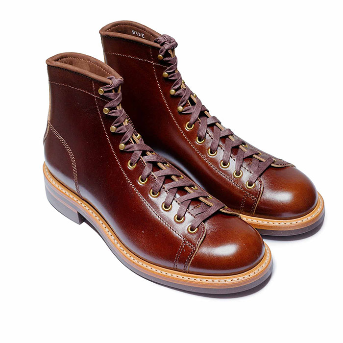
gangstercopysmaller.jpg


oil on canvas. 22" x 18".​
 

Dixon Cannon

My Mail is Forwarded Here
Messages
3,157
Location
Sonoran Desert Hideaway
Artography

http://art-ography.blogspot.com/

The art of art. I had quite a run at photographing art in the Phoenix/Scottsdale area some years ago.
The photography of course is incidental to the artworks being photographed - the point being to highlight
the artists work and not the 'spectacular' photograph. I was quite proud of the work actually as it sold a
lot of work for the artists. I became wealthy, retired early, patronize the arts and live largely (NOT!).

-dixon cannon
 

deadpandiva

Call Me a Cab
Messages
2,174
Location
Minneapolis
Herringbonekid-I love your painting. I wish I had the resources to work in oils.
Quigley Brown-That program is amazing. I wish I hadn't checked out the entries for the scary picture contest though. :eek:
 

lyburnum

Practically Family
Messages
568
Location
London, UK
This is the reason why I haven't been on the Lounge much in the last week or so:

banquetmerchry7.jpg


It was a commission by a local record shop for their tshirt and hoodie design. This is the third design I did for them and the first one they liked - been a stressful week as I've only had 5 days to produce it. Argh.

I'm also working on a tote design for them, but that's not quite finished yet.
 

Lady Day

I'll Lock Up
Bartender
Messages
9,087
Location
Crummy town, USA
This was fun

I did storyboards for a commercial and I finally got the final and matched stills to the boards. They followed the boards fairly faithfully. Its always cool to see the comparison. :)

LD
 

fatwoul

Practically Family
Messages
923
Location
UK
HBK - Excellent. Any more like this?

DC - Enjoyed your work. It's rewarding when one's photography helps to promote another artist, isn't it? I've certainly found that to be the case recently.

lyburnum - graphic design scares me, by association, but that's not your fault. Good work.

Miss Brill said:
I took 200 photos today--and this one is my favorite:
2092312644_d28d422497.jpg

Know what I like about this? The bands of colour that divide the scene. The simplicity. The fact that the deers are looking into the woods. Lots of things.

Lady Day said:

Yes, that was fun to look at, too. Thank you.
 

fatwoul

Practically Family
Messages
923
Location
UK
Miss Brill said:
I hadn't noticed the bands of color! :eek:

Well, I kinda saw it like this:

MissBrill01.jpg


The dimensions of the image aren't golden section (1:1.618), but using simple thirds, the image breaks down quite nicely too:

MissBrill02.jpg


The biggest tree trunk lies on a third, and leads down to the baby deer, and the white flash of the baby's tail lies on a third up from the bottom of the image, which is where the brown grass ends too.

The adult deer doesn't lie on any of the thirds of the entire image, but when you think of the big tree and the brown grass as framing the centre-left third:

MissBrill03.jpg


The adult deer's tail and neck lie on thirds, with its white ears crossing on another third.

...I'm so glad I don't have Asperger Syndrome. I'd probably see little white composition lines on everything. lol
 

Miss Brill

One Too Many
Messages
1,199
Location
on the edge of propriety
I wish I'd been thinking that artistically when I took it! lol

I'm always thinking "rule of thirds, rule of thirds, rule of thirds..." then I start trying to see the picture I want & forget about the rule of thirds. :eek:

fatwoul said:
Well, I kinda saw it like this:

MissBrill01.jpg


The dimensions of the image aren't golden section (1:1.618), but using simple thirds, the image breaks down quite nicely too:

MissBrill02.jpg


The biggest tree trunk lies on a third, and leads down to the baby deer, and the white flash of the baby's tail lies on a third up from the bottom of the image, which is where the brown grass ends too.

The adult deer doesn't lie on any of the thirds of the entire image, but when you think of the big tree and the brown grass as framing the centre-left third:

MissBrill03.jpg


The adult deer's tail and neck lie on thirds, with its white ears crossing on another third.

...I'm so glad I don't have Asperger Syndrome. I'd probably see little white composition lines on everything. lol
 

Forum statistics

Threads
109,306
Messages
3,078,466
Members
54,244
Latest member
seeldoger47
Top