Want to buy or sell something? Check the classifieds
  • The Fedora Lounge is supported in part by commission earning affiliate links sitewide. Please support us by using them. You may learn more here.

New Aero Elvis fqhh

Edward

Bartender
Messages
25,074
Location
London, UK
I'm not a low rise guy myself either. My pants usually sits about half inch below my belly button. This in today's standard would be considered high rise. Lol. But it probably just mid rise compared to the 30s. I remember I had a tux that had very high waist-ed pants, above my belly button and I would assumed that's how they rolled back then, especially without the use of belts.
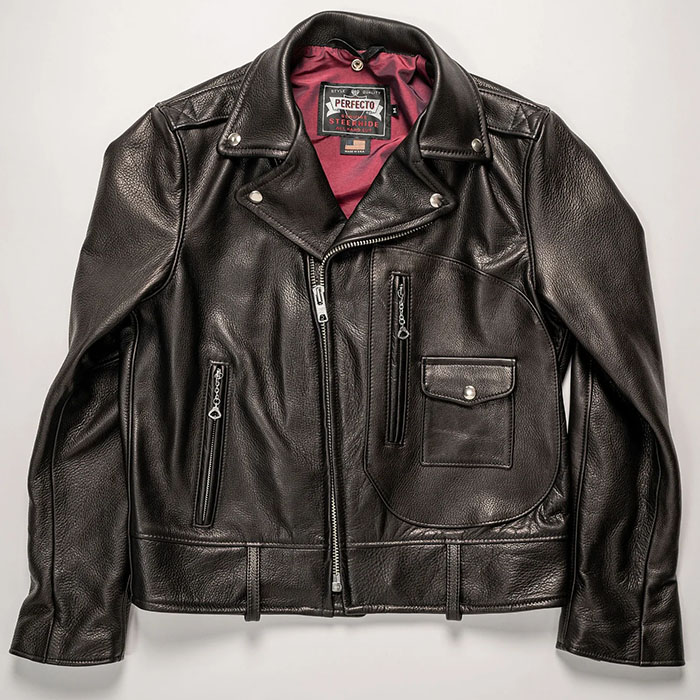
I also prefer the Elvis / Indian Ranger / Kotr cuts over the standard J106 cut. The standard J106 is really based off the civilian half belt blocks, where as the 50s bike jackets are a special breed. Sometime down the road I'd like to try a size larger just to see how it fits. Many people associate black leather with these designs but brown versions were marketed alongside the black version for a small premium. I bet there were quite a few brown ones out and about but the black and white photos kinda skew the perception a bit.

B&W photos definitely impact on colour perception; charcoal grey, navy blue, brown can all look like black in monochrome. Probably, ironically, why black leather gained it's "bad boy" image. The Sixties rockers in the UK (a movement that really had its heyday from 1959 to 1965) definitely gravitated more to black leather because that's what they at least perceived they saw on screen. It's not unlike to modern perception that German army uniforms in WW2 were grey, when in fact they wore fieldgrau, a shade of green, almost exclusively from, if memory serves, 1940-45. Most people have only ever seen those uniforms in B&W....

There's a great thread somewhere on TFL, with a lot of great information from @LizzieMaine about this in 30s/40s Hollywood cinema, discussing how all the outfits that look so amazing in old B&W movies often looked bizarre in real life because what matched well in B&W often looked like hideous combinations in reality because of colour clashes and such. I seem to remember reading somewhere that a lot of screen goddesses of the period were actually wearing *blue* lipstick on camera, because it worked better in B&W than any red (which it was supposed to evoke). I definitely recall that the 'blood' in the shower scene in Psycho was uncoloured, untreated chocolate sauce, thus brown in real life!

(Course, colour film aren't immune from this either; in some shots, lighting dependent, in The Great Escape, Steve Macqueen's A2 looks almost black.) I'm sure plenty of brown jackets were indeed taken for being black; it's not so long ago that after years of the Aero Waterfront being in green that it came to light Brando's original jacket was red. (Prefer the green myself, but....). :)
 

Canuck Panda

I'll Lock Up
Messages
4,679
B&W photos definitely impact on colour perception; charcoal grey, navy blue, brown can all look like black in monochrome. Probably, ironically, why black leather gained it's "bad boy" image. The Sixties rockers in the UK (a movement that really had its heyday from 1959 to 1965) definitely gravitated more to black leather because that's what they at least perceived they saw on screen. It's not unlike to modern perception that German army uniforms in WW2 were grey, when in fact they wore fieldgrau, a shade of green, almost exclusively from, if memory serves, 1940-45. Most people have only ever seen those uniforms in B&W....

There's a great thread somewhere on TFL, with a lot of great information from @LizzieMaine about this in 30s/40s Hollywood cinema, discussing how all the outfits that look so amazing in old B&W movies often looked bizarre in real life because what matched well in B&W often looked like hideous combinations in reality because of colour clashes and such. I seem to remember reading somewhere that a lot of screen goddesses of the period were actually wearing *blue* lipstick on camera, because it worked better in B&W than any red (which it was supposed to evoke). I definitely recall that the 'blood' in the shower scene in Psycho was uncoloured, untreated chocolate sauce, thus brown in real life!

(Course, colour film aren't immune from this either; in some shots, lighting dependent, in The Great Escape, Steve Macqueen's A2 looks almost black.) I'm sure plenty of brown jackets were indeed taken for being black; it's not so long ago that after years of the Aero Waterfront being in green that it came to light Brando's original jacket was red. (Prefer the green myself, but....). :)
This exactly. I've always thought something was up after seeing a few (faded) colored photos in the old B/W catalogues. Those colors were not conservative at all. I wonder how people shopped with B/W catalogue back then, with only a few pages printed in color, the rest are still black and white. Very interesting. A century later we are still more or less the same.
 

Edward

Bartender
Messages
25,074
Location
London, UK
This exactly. I've always thought something was up after seeing a few (faded) colored photos in the old B/W catalogues. Those colors were not conservative at all. I wonder how people shopped with B/W catalogue back then, with only a few pages printed in color, the rest are still black and white. Very interesting. A century later we are still more or less the same.

I suspect people were less picky about exact shades in those days. Either that, or they shopped in-store if they were! ;)
 

born113

One of the Regulars
Messages
270
B&W photos definitely impact on colour perception; charcoal grey, navy blue, brown can all look like black in monochrome.
NikolayII-bw-col+.jpg

I just came across a photo that was colorized based on the available historical description of the event and clothing.
 
Messages
16,810
View attachment 402919
I just came across a photo that was colorized based on the available historical description of the event and clothing.

I own the uniform on the far right & I believe the collar and the stripes on the arms should be red. The color of the uniform ought to be much more vivid, almost teal green. This olive drab is more appropriate for a common soldiers uniform of this particular army.
 

born113

One of the Regulars
Messages
270
I own the uniform on the far right & I believe the collar and the stripes on the arms should be red. The color of the uniform ought to be much more vivid, almost teal green. This olive drab is more appropriate for a common soldiers uniform of this particular army.
Do you have a 1900s uniform?
 
Messages
16,810
Do you have a 1900s uniform?

I have one left and I had several. They aren't hard to come by where I live, Austro-Hungarian and Kingdom of Yugoslavia ones, which, in my opinion, are the most beautiful pre-WW1 uniforms ever made.

I often wear my Austro-Hungarian winter coat and always plan to have it remade into a leather version.
 

born113

One of the Regulars
Messages
270
I have one left and I had several. They aren't hard to come by where I live, Austro-Hungarian ones and Kingdom of Yugoslavia ones, which, in my opinion, are the most beautiful pre-WW1 uniforms ever made.
I don't know all the people in this photo. But I recognized one here. And this is the Russian Tsar.
In general, I strongly doubt that it was in this photo that the restorers made a mistake, since there are plenty of uniform samples in museums.
And for me personally, it is more important to confirm the fact that it is sometimes impossible to understand the real color in old photos.
 
Last edited:

Forum statistics

Threads
109,129
Messages
3,074,673
Members
54,105
Latest member
joejosephlo
Top