vintage68
Practically Family
- Messages
- 959
- Location
- Nevada, The Redneck Riviera
I'm liking the grey background, much easier on my eyes. Not so happy with the "senior member" designation. I prefer "practically family."
This is not a big thing, but whenever I click to the main page, it asks me to log in, even if I am already logged in. I can navigate around fine once I get away from the front page. Also when I do log in and it redirects me, it is still on the page prompting me to log in or register until I click to some other page.
Also, have the postcount titles changed? Because I don't remember being a Senior Member, and I couldn't find anything in the FAQ.
Also, is there a reason we can no longer have code in our signatures?
I do really like the upgrade.
Delete your cookies.
Member titles were messed up in the upgrade-- I'll get on fixing them.
I'll look into the bbcode in signatures.
I'm liking the grey background, much easier on my eyes. Not so happy with the "senior member" designation. I prefer "practically family."
Looks flash.
(no reference to Adobe, thats just an Australianism for pretty looking. )
The settings for the use of code in Signatures is turned off by default, apparently. I couldn't locate a way to turn it on for myself, so is that something that has to be done behind the scenes?
Brad
As an old timer, this will take some getting used to! I like it but I'll miss the "classic" version.
I miss it as well. I'm going to try to get back to the same "feel" of the original as best I can, but still with good features.
What browser/OS?
Mac OSX, and I have the same problem in Chrome and Firefox.
Are you running incognito or private browsing mode?
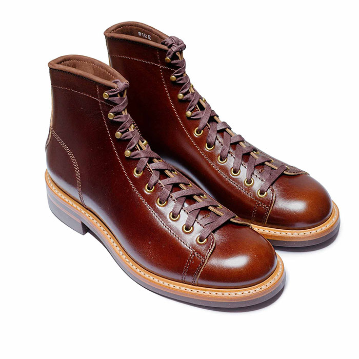 John Lofgren Monkey Boots Shinki Horsebuttt - $1,136 The classic monkey boot silhouette in an incredibly rich Shinki russet horse leather.
 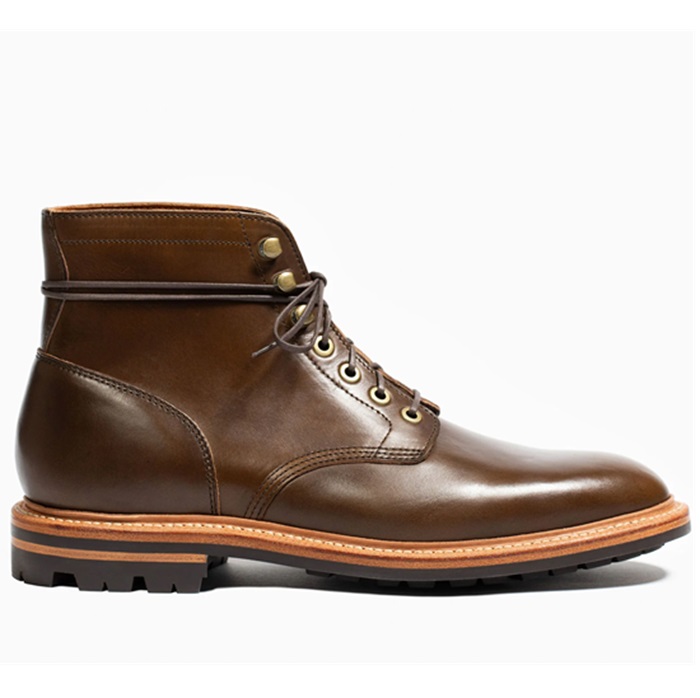 Grant Stone Diesel Boot Dark Olive Chromexcel - $395 Goodyear welted, Horween Chromexcel, classic good looks.
 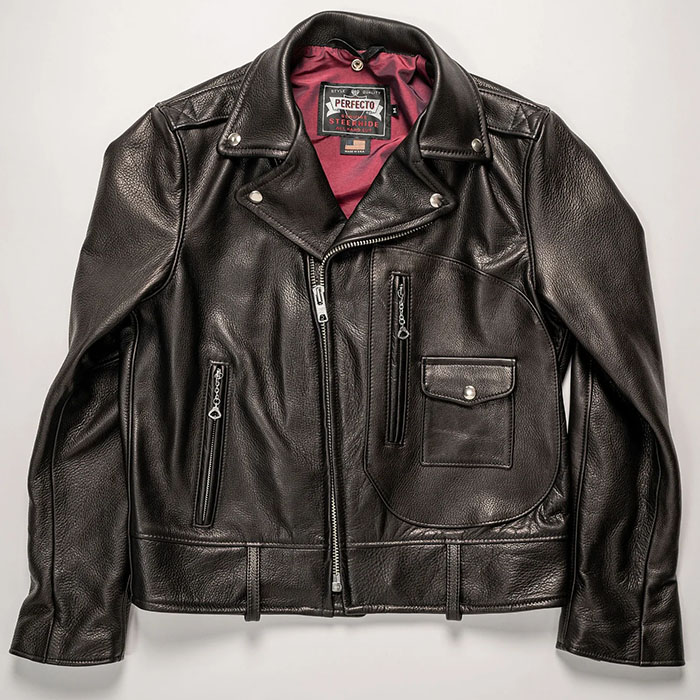 Schott 568 Vandals Jacket - $1,250 The classic Perfecto motorcycle jacket, in a very special limited-edition Schott double rider style.