Indy Magnoli
Vendor
- Messages
- 600
- Location
- Middle Earth, New Zealand
If you prefer the neat pattern, go ahead and vote for it and we can tweak the design afterwards.
Kind regards,
Indy
Kind regards,
Indy
I'm not sure about the yellow, but making them a little simpler and black or white would look great.Jack Scorpion said:This one is perfect if the logos were smaller and fewer, I think. Wouldn't hurt to add a little yellow in the logos, either.


Indy Magnoli said:
MK said:
Baron Kurtz said:What on earth is happening on the second and third from the left?
if the one far right is to be any use, that motif need to go MUCH higher - see Jack's example earlier. Pointless it being there if you can't see it with a jacket on . . .
bk

jamespowers said:Hmmm.... kind of too many of the little fellas on that tie. If the number were cut by 2/3rds, then it might be a little less busy with the army of fedora.

Regards,
J
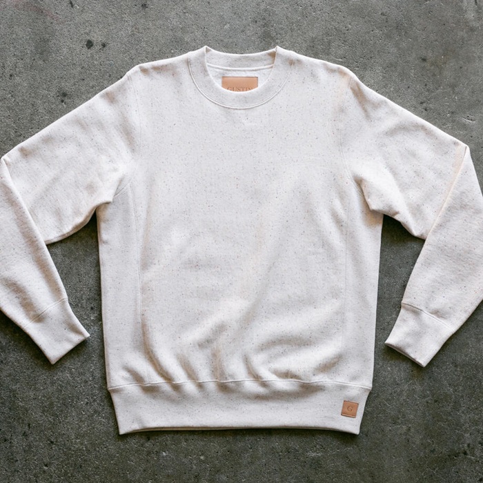
 Gustin Vintage Heavyweight Sweatshirt - Natural Rainbow Nep - $119 Rugged 14oz cotton that gets better with every wear.
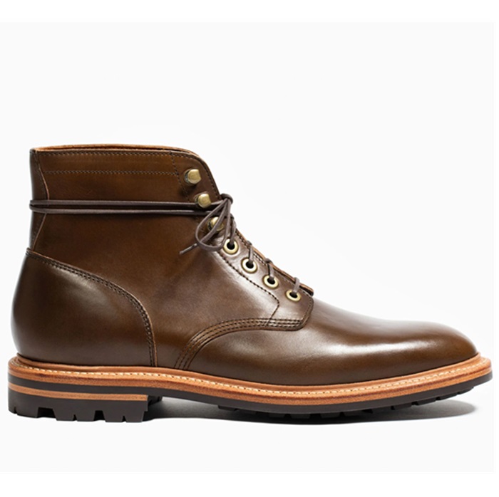
  Grant Stone Diesel Boot Dark Olive Chromexcel - #395 Goodyear welted, Horween Chromexcel, classic good looks.
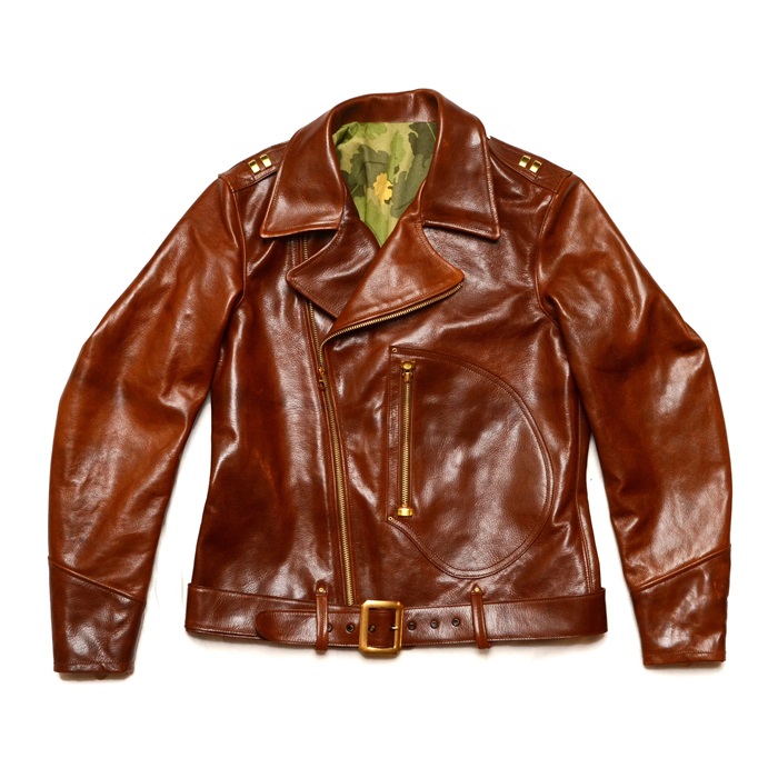
  Himel Bros. - The Ross Mk. 1 Leather Jacket Classic D-pocket motorcycle/aviator style jacket.
 Orgetorix said:I think it's meant to show the sheen of the silk. Or something like that. Or maybe it's going for the vintage-tie-that's-been-faded-by-the-sun look. Either way, it's pretty bad.
Zemke Fan said:I like the *noir* feel of this one, boss!
