Want to buy or sell something? Check the classifieds
  • The Fedora Lounge is supported in part by commission earning affiliate links sitewide. Please support us by using them. You may learn more here.

Fedora Lounge Club Tie -Poll Added, Options on 1st Post.

What color sceme/style should be used for the Fedora Lounge Club Tie?

  • A: Yellow-Gold/Grey-Blue on Black

    Votes: 0 0.0%
  • B: Red & Yellow Pinstripes on Black

    Votes: 0 0.0%
  • C: Blue & Yellow Pinstripes on Black

    Votes: 0 0.0%
  • D: Bold Red & Yellow on Black

    Votes: 0 0.0%
  • E: Deco Blues

    Votes: 0 0.0%
  • F: Neat Pattern

    Votes: 0 0.0%

  • Total voters
    0
Status
Not open for further replies.
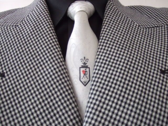
For E, how about setting the emblem up high so it can be seen if wearing a jacket?
DSCF0829.jpg


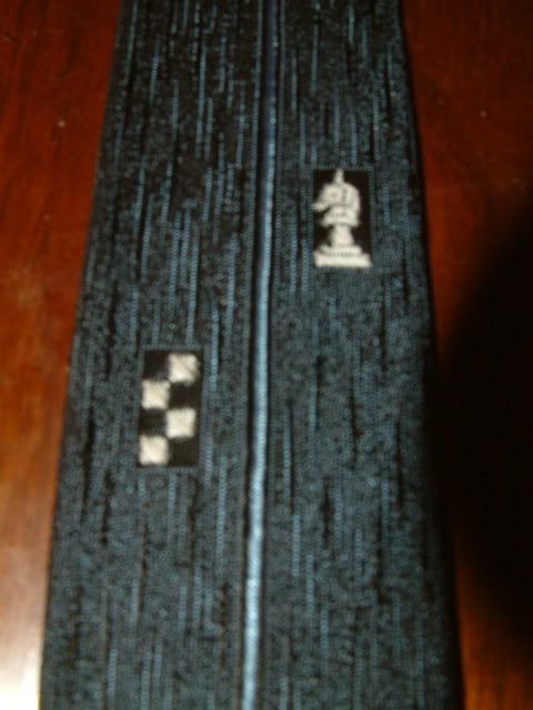
Maybe a reverse of the colors, too. What's black could be white (or light blue) and what's black could be white. I think it would appear less severe.
DSCF0002.jpg
 

BellyTank

I'll Lock Up
Technonut said:
Taste is subjective.... :rolleyes: I want something fun. Like the set of FL glasses and hat pin that I have. :) I do not plan on wearing the tie to a business meeting. If I want just another boring, tasteful tie, I could purchase one anywhere. Just my take on the matter... [huh]


Now we really have the "fUn VS sophisticated" situation.

Both parts have stated their cases.

Hmmm...

B
T
 

John K Stetson

One of the Regulars
Messages
105
Location
philadelphia
Logo Position: Vest Consideration ?

Only an comment/observation: I was thinking about the logo position (low or high) - it seems many FL'ers do wear vests from time to time. A low logo would not be seen...Senator Jack illustrated that, albeit with a jacket.

I do wish I had some of my father's ties.
 
Indy Magnoli said:
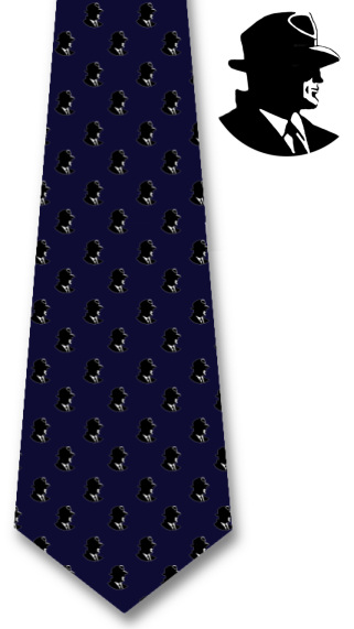
And one last design before the voting starts, for the neat pattern folks:

fl-v7.jpg


I'll be adding a poll at the start of this thread, so please chime in with your vote...

Kind regards,
Indy

Hmmm.... kind of too many of the little fellas on that tie. If the number were cut by 2/3rds, then it might be a little less busy with the army of fedora. ;) :D

Regards,

J
 

Jack Scorpion

One Too Many
Messages
1,097
Location
Hollywoodland
Indy Magnoli said:
And one last design before the voting starts, for the neat pattern folks:

fl-v7.jpg


I'll be adding a poll at the start of this thread, so please chime in with your vote...

Kind regards,
Indy

This one is perfect if the logos were smaller and fewer, I think. Wouldn't hurt to add a little yellow in the logos, either.
 
Status
Not open for further replies.

Forum statistics

Threads
109,130
Messages
3,074,687
Members
54,104
Latest member
joejosephlo
Top