Want to buy or sell something? Check the classifieds
  • The Fedora Lounge is supported in part by commission earning affiliate links sitewide. Please support us by using them. You may learn more here.

Esquire’s Complete Golden Age Illustrations:

Tiki Tom

My Mail is Forwarded Here
Messages
3,399
Location
Oahu, North Polynesia
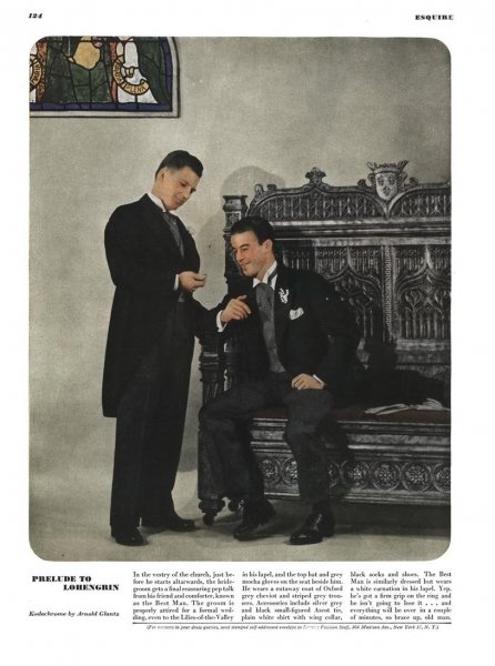
Amazing eye for detail. And the shoes match the hat and the pocket square, yet “clash” with the blue suit. There is only one word for it: sprezzatura. Unstudied, casual, easy going elegance. (The real thing. Not the over-blown, over-studied Version of modern “sprezzatura.”)
 

Fastuni

Call Me a Cab
Messages
2,277
Location
Germany
What would you prefer?

I'd prefer the shirt to have a lighter color. That dark red in my opinion only goes with a very light colored sportcoat.

The tie should not be in a (near) same color as the sportcoat. If it has to be brown (I'd prefer a different color for a brown sportcoat) at least a different shade or with pattern.
 
Last edited:

Flanderian

Practically Family
Messages
833
Location
Flanders, NJ, USA
I'd prefer the shirt to have a lighter color. That dark red in my opinion only goes with a very light colored sportcoat.

The tie should not be in a (near) same color as the sportcoat. If it has to be brown (I'd prefer a different color for a brown sportcoat) at least a different shade or with pattern.

I think that would be very appealing!
 

Flanderian

Practically Family
Messages
833
Location
Flanders, NJ, USA
This is Esquire February 1946.


Esq024601.jpg


Esq024602.jpg


Esq024606.jpg


Esq024607.jpg


Esq024608.jpg


Esq024609.jpg


Esq024603.jpg


Esq024605.jpg


Esq024604.jpg
 
Messages
17,225
Location
New York City
As has been noted before, the people in the drawings look so much better than the people in the photographs. So, folks, dress as though you are in an Esquire illustration.

I always thought it was a truism that the preference/style was for curvier women’s figures in the golden era. Apparently not in Esquire. All these dames got the tall, skinny look that highfalutin fashion still seems to demand today.

In the movies, and as you note, in Esquire, in the '30s and into the '40s, it was not a curvier women's figure world. Most of the Hollywood actresses at that time had small chests and modest curves.

Perhaps, some of this was a holdover from the flapper-era of the '20s when androgyny - flat chested (girls actually tried to suppress their breasts via undergarments), drop-waists and hip-less - was the ideal for the modern women. To be sure, there were exceptions (see Jane Russell in Howard Hughes' "The Outlaw," but that was a '40s not '30s thing), but in general, a slimmer silhouette was the preference.

It wasn't until post WWII and into the '50s that the full-figured, curvy women became the ideal. Not only Marilyn, but actresses like Mamie Van Doren, Diana Dors and others became the new look.

That said, and to your point, fashion models have always been tall and very thin, even in the '50s. But the stars, whom the public followed much more than the models, were more full-figured in the '50s.
 
Last edited:
Messages
17,225
Location
New York City
Kinda neat what they did here having - and the explanation isn't clear to me - almost two fabrics back to back so that the "liner" of his overcoat is, effectively, a differently patterned wool.
Esq014601.jpg


Far from his best picture, but Fred Astaire is one of the few "real" humans in Esquire who can hold his own with the idealized illustrations. Note, I write these comments as I go, so I see that I am late to the party as others made this comment before me. I'm glad to be in such good company.
Esq014608.jpg


Astonishing to me that this publication didn’t refuse to print Lord Calvert ads.
Watching the small printing it’s already been those old days a pretty cheap booze and still is today. Just found a Walmart ad for 1.75l of that defroster for under 16,- bucks...:D

I agree, doesn't fit the feel or style of Esquire. My guess, they needed the advertising dollars. It probably was as simple as that.


Just a really nice illustration. He or she (can't make out the name of the illustrator) captured a very natural look in the woman.
Esq024602.jpg
 

Flanderian

Practically Family
Messages
833
Location
Flanders, NJ, USA
Kinda neat what they did here having - and the explanation isn't clear to me - almost two fabrics back to back so that the "liner" of his overcoat is, effectively, a differently patterned wool.
View attachment 277263


Far from his best picture, but Fred Astaire is one of the few "real" humans in Esquire who can hold his own with the idealized illustrations. Note, I write these comments as I go, so I see that I am late to the party as others made this comment before me. I'm glad to be in such good company.
View attachment 277264


I agree, doesn't fit the feel or style of Esquire. My guess, they needed the advertising dollars. It probably was as simple as that.


Just a really nice illustration. He or she (can't make out the name of the illustrator) captured a very natural look in the woman.
View attachment 277265

1. I think the cloth in the inset photo may be what I've read referred to as double faced cloth. If so, it is actually woven to present two different appearances on each side. But I don't know enough about the process to be certain.

2. Agree entirely regarding Astaire. Part of the reason most models in photos compare so poorly to those in drawn illustrations is that, frankly, most are comparatively pretty poor photos. But Freddy's superb sense of style and dancer's physique helps overcome this to a degree.
 
Last edited:
Messages
17,225
Location
New York City
I disagree with "Esquire" on this one as I think the coat's shortness (just below the knee) and broadness (long lapel roll) make the coat and the wearer look short and stocky and not, as "Esquire" claims, "stretched" with the "illusion of greater length."
Esq034601.jpg
 

Flanderian

Practically Family
Messages
833
Location
Flanders, NJ, USA
I disagree with "Esquire" on this one as I think the coat's shortness (just below the knee) and broadness (long lapel roll) make the coat and the wearer look short and stocky and not, as "Esquire" claims, "stretched" with the "illusion of greater length."
View attachment 277578


How dare you!? ;)

If you read enough of Esquire's accompanying text throughout the Golden Age years, you notice that they will often disagree with themselves! Sometime several times on a single topic. :D

But I agree entirely with you concerning this specific example. Though I do feel as a it can depend to a degree upon the physique of the particular man, and the other aspects of the coat he is wearing, though in general, a longer coat is more universally flattering.
 

Staff online

Forum statistics

Threads
109,333
Messages
3,079,068
Members
54,279
Latest member
Sivear
Top