Want to buy or sell something? Check the classifieds
  • The Fedora Lounge is supported in part by commission earning affiliate links sitewide. Please support us by using them. You may learn more here.

Your opinion

Aaron Hats

Vendor
Messages
539
Location
Does it matter?
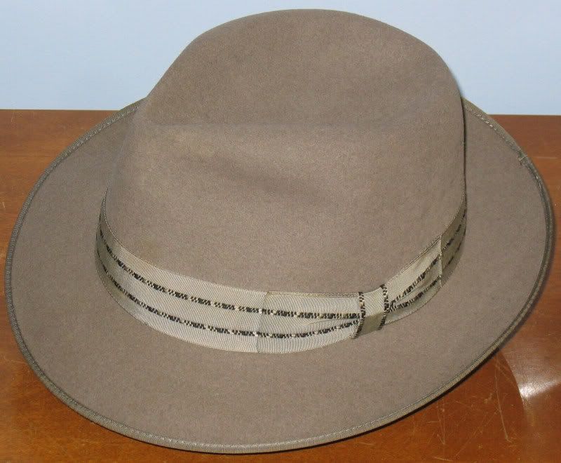
This is a sample of a hat we are working on and would like your opinion about the styling and color. I don't want to give too many details other than it's a fur felt, 4" crown, 2 1/2" brim. The first is light grey and the second tan/beige. Don't worry about hurting my feelings, I want an honest assessment.

Aaron-Sample1.jpg

Aaron-Sample1A.jpg

Aaron-Sample1B.jpg

Aaron-Sample1C.jpg


Bartenders, If this is inappropriate feel free to delete.

Thanks,

Aaron
 

Flieger

Practically Family
Messages
570
Location
Umea, Sweden
Aaron: I would definetley consider the grey one! I love that silver-grey (on my monitor at least) color, the thin ribbon, crease and the bound edge - Just the kind of lid I desire. *add smiley with watering mouth* :)

Flieger
 

HamletJSD

A-List Customer
Messages
472
Location
Birmingham, AL
Send me a free sample of the tan one and I'll tell you exactly what I think ;)

Seriously, though, they do look very elegant ... even if a tad conventional. I'm still new to this, though, so I can only judge based on other pics I have seen
 

Aaron Hats

Vendor
Messages
539
Location
Does it matter?
Thank you for the feedback. Yes, it is conventional and was intended to appeal to the widest possible number of customers. This is, or will be, a starter hat priced under $100. It's not really intended for the serious hat wearer but something the hat novice can feel comfortable in.

Please keep the feedback coming.

Aaron
 
Ok, You asked.

The gray would be my choice as to color but I would think that both need a higher crown. The wide brim and short crown make them look too Trilbyish for my taste.
The back kickup is also a bit too high up and cup shaped. It needs to be flatter and not run into the snapped down point of the brim at the front.
I can't see the ribbon very clearly but the stitching holding the bow on is pretty pronounced.
I would have to see it in person to critique it further---and no that doesn't mean a shameless send me one to look at. :p

Regards,

J
 

Dinerman

Super Moderator
Bartender
Messages
10,562
Location
Bozeman, MT
I like it. The tan looks better to me. (something about having more contrast between the felt and the ribbon)
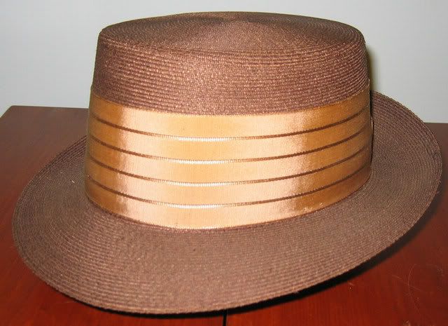
What I think would make it look a lot better would be a pleat in the center tie of the ribbon (there's got to be a name for that thing)
I know that's a small detail, but I think it would give this hat a lot more class.

Stylewise, it reminds me of something Champ would have turned out in the later half of the '50s.
 

Feraud

Bartender
Messages
17,190
Location
Hardlucksville, NY
The brim is a bit wide compared to the crown in my opinion. A taller crown or a shorter brim would balance the hat.
I like the bound brim and ribbon style.
 

HamletJSD

A-List Customer
Messages
472
Location
Birmingham, AL
Several have mentioned a higher crown ...
but if this is meant to be a starter level hat I think the crown is perfect. It takes time to get used to wearing a higher crown, as many on the Lounge have pointed out to many a newbie. If you throw someone who has never been a big fedora wearer into a tall crown they will probably dislike it and shy away from future purchases ...
I am sticking to ... I like it! :eusa_clap :eusa_clap :eusa_clap
 

Zig2k143

Practically Family
Messages
507
Location
Drums, Pa
Dinerman said:
I like it. The tan looks better to me. (something about having more contrast between the felt and the ribbon)
What I think would make it look a lot better would be a pleat in the center tie of the ribbon (there's got to be a name for that thing)
I know that's a small detail, but I think it would give this hat a lot more class.

Stylewise, it reminds me of something Champ would have turned out in the later half of the '50s.


I like the pleat idea.. I like it if the ribbon was darker grey.
 
Messages
10,931
Location
My mother's basement
I'm with Dinerman as to color and Fletch and jamespowers as to dimensions. It wasn't so long ago that I may very well have bought one, had they been on the shelf of our local hat retailer. They certainly appear to be every bit as appealing as your run-of-the-mill Stetson or Bailey or Biltmore. More appealing, maybe. And at that price, I imagine they'll sell. It's probably a good choice for an average guy's "starter" hat. Not too dressy, you know, and not so expensive as to leave one fearful of wearing it in rough weather.
 
S

Samsa

Guest
The design looks good to me, especially considering your target demographic. That said, something bothers me about the gray hat. It might just be my laptop, but the ribbon color looks almost mottled/dirty/aged. I know it's darn near impossible to get an accurate photograph of a hat (at least color-wise), so it's hard to say not seeing it in person.
 

Aaron Hats

Vendor
Messages
539
Location
Does it matter?
jamespowers said:
The back kickup is also a bit too high up and cup shaped. It needs to be flatter and not run into the snapped down point of the brim at the front.

I agree. That was the first thing I noticed.

Samsa said:
It might just be my laptop, but the ribbon color looks almost mottled/dirty/aged.

This ribbon on the grey hat is a bit odd. Under different conditions it picks up a blue tint, at other times a green tint and again at other times it's pure grey.

Thanks all for the feedback. More is welcomed.

Aaron
 

feltfan

My Mail is Forwarded Here
Messages
3,190
Location
Oakland, CA, USA
I have to add to the chorus that the crown should be higher.
The bow doesn't quite come to life for me, either. For a
middle of the road hat, you might consider a ribbon 2-3 times
that wide, perhaps with a gimmick, like those ribbons Art has
been using on his new hats or the woven stripes in some 50s ribbons
(doesn't Dinerman have a Champ with a nice example?). Eye catching,
but not too wild.

Personally, I don't like that narrow, machine stamped-looking
c-crown. I'd rather see a 5 point diamond crown or a crease.
That narrow c-crown accentuates the taper and looks too
molded.

That said, I'm thrilled to see you working on such a project.
You tell those big guys how to make hats!
 

HamletJSD

A-List Customer
Messages
472
Location
Birmingham, AL
jamespowers said:
The back kickup is also a bit too high up and cup shaped. It needs to be flatter and not run into the snapped down point of the brim at the front.

J


I thought that was just a trait of the way it was photographed ... lots of shadow in that "cup" ... but good catch
 

DanielJones

I'll Lock Up
Messages
4,042
Location
On the move again...
I have to add my voice to the higher crown choir. It would help balance the width of the brim. Also, I have to agree with Feltfan on the C crown, it tapers the crown and usually makes ones head look smaller since the balance is not there with the brim. Now I like the tan hat. The ribbon and the brim treatment are contrasted nicely. The grey is a lovely color with a shade of blue to it. But, the ribbon and brim binding look to blend into the color of the hat. Maybe something in a steel blue or a darker grey (not a charcoal color) would contrast quite nicely. Just a shade or two.
Other than that they are a nice pair of hats that will dress up any outfit.

Cheers!

Dan
 

scotrace

Head Bartender
Staff member
Messages
14,392
Location
Small Town Ohio, USA
Those are great looking hats, Aaron; you're onto something.

My first thought was also that the crown seemed machine-molded, which it is, but perhaps that effect could be softened a bit?

I personally like a lot of "cup" at the back that extends forward. It doesn't usually look so pronounced when worn as it does off-head like this.

Nice hat. :)
 

Dinerman

Super Moderator
Bartender
Messages
10,562
Location
Bozeman, MT
I think it's one of the most classic looking new production hats I've seen on here. A little bit of tweaking, and I think you'll really have something.

:eek:fftopic:
feltfan said:
For a
middle of the road hat, you might consider a ribbon 2-3 times
that wide, perhaps with a gimmick, like those ribbons Art has
been using on his new hats or the woven stripes in some 50s ribbons
(doesn't Dinerman have a Champ with a nice example?). Eye catching,
but not too wild.

I've got a couple hats with stripes- which one were you thinking of?

IMG_3437.jpg

marathon
greybrent.jpg

brent
IMG_3510.jpg

champ
 

Forum statistics

Threads
109,127
Messages
3,074,661
Members
54,105
Latest member
joejosephlo
Top