Want to buy or sell something? Check the classifieds
  • The Fedora Lounge is supported in part by commission earning affiliate links sitewide. Please support us by using them. You may learn more here.

Vintage neon signs

LizzieMaine

Bartender
Messages
33,766
Location
Where The Tourists Meet The Sea
zcsmmewc.jpg


That's a pretty good approximation of the actual Apollo command and service modules of the 1960s -- it's kind of surprising to see a big neon job like that being manufactured that late in the game. Public opinion in the mid-sixties had already turned emphatically anti-neon, and many towns were passing ordinances against such signs.
 

LizzieMaine

Bartender
Messages
33,766
Location
Where The Tourists Meet The Sea
I know that is true, but why were these widespread abominations considered OK?
Nothing screams trash like one of these sitting out front weighted down with a pile of concrete blocks.

I suspect the sudden appearance of such masterful examples of the signmakers' art was a way of getting around local ordinances. The owner could easily say when the code officer came around, "It's temporary! Lookit the wheels! Ord'nance don't say nothin' 'bout temporary signs!"

The mid-sixties "highway/downtown beautification" movement is worthy of study, I think. It led to an aesthetic homogenization the likes of which the country had never seen before -- some critics called it "The Browning Of America," thanks to all the brown fake mansard roofs and phony composition brickface going on gas stations, motels, and fast food joints. And because it was such a uniform look it dated almost immediately, the American equivalent to cinder-block apartment houses in East Germany.

How this tedious, unattractive look suddenly became the Desired Ideal for the entire country is a story worth examining, but it's gotten comparatively little study over the years. When it's discussed you'll generally get a mention of Lady Bird Johnson, and "women's club agitation," but seldom does the finger point where it really ought to be pointed -- straight at the Boys From Marketing and their theories of "place-product-packaging" which drove this push for suburbanized uniformity.

Brown was a color that promoted feelings of "hominess" and "trust" according to the psychological manipulators advising the Boys, and the idea was that wherever you were, whether you were driving into a gas station or buying a cheap soggy hamburger or even going to the proctologist in an office park, what you really craved was the warm embrace of home and hearth. Thus soothed, the Boys theorized, you were more amenable to spending more money, because home, after all, is where the wallet is. Bright colors, on the other hand, like you find on flashy neon signs and shiny porcelain enamel walls, got you agitated and worked up and actually made you defensive about spending money, and we wouldn't want that....
 
Messages
13,672
Location
down south
And because it was such a uniform look it dated almost immediately, the American equivalent to cinder-block apartment houses in East Germany.

That's a pretty spot on observation. The homogenization of America. From Maine to Mississippi the freeway exits all look the same. The only way I know I'm in another part of the country is the accent of the cashier.

Sent from my SM-G920V using Tapatalk
 

2jakes

I'll Lock Up
Messages
9,680
Location
Alamo Heights ☀️ Texas
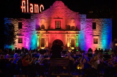
Beautiful neon could be seen from a distance at night!
neon.jpg

Route 66 on Clayton Road junction of South Skinker Blvd. St. Louis

rte_66_red_crown_courtesy_missouri_historical_society_images.jpg

1937
The thought about what the market for gas was like back at the time. One could assume that the competition was fierce to sell in the depression era, and the oil companies had to resort to such over-the-top signage.
 
Last edited:
Messages
17,220
Location
New York City
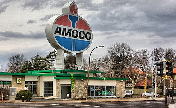
That sign lasted until 1959, when it was torn down and replaced by Standard of Indiana's new internally-lit torch-and-oval logo. The revised sign survived the elimination of the Amoco brand by BP and is now ready to go as the brand is being resurrected.

homeSlideShow05.png

Interesting that BP still sees brand value in Amoco. And funny that the sign survived long enough to come back into use. Was it (1) happenstance (2) historical preservation protection in some way or (3) too darn expensive to remove?
 

LizzieMaine

Bartender
Messages
33,766
Location
Where The Tourists Meet The Sea
I think it was probably a combination of all three. The sign is very popular in St. Louis as a kitsch landmark, and there would likely have been an uproar if BP decided to take it down. Plus BP's own logo is incredibly lame, so if they put it up there in place of the Amoco sign it would face much derision.

The torch-and-oval clearly wasn't thought up by a marketing psychologist and approved by a focus group -- it's a combination of the Standard of Indiana torch and the American Oil Company oval, probably scratched out on the back of an envelope in 1947 -- and people seem to instinctively appreciate its lack of Boys From Marketing polish.

Standard-Indiana-porcelain-sign-oil-gas-vintage-gasoline.jpg


41IYDdIIc6L._SX463_.jpg

It's hokey, but in a good way. I think people are ripe right now for the return of that kind of corny logo as a relief from the hyper-processed high-tech trademarks we've had shoved down our throats over the last thirty years or so.
 

Forum statistics

Threads
109,303
Messages
3,078,372
Members
54,244
Latest member
seeldoger47
Top