Want to buy or sell something? Check the classifieds
  • The Fedora Lounge is supported in part by commission earning affiliate links sitewide. Please support us by using them. You may learn more here.

As seen on "The Sartorialist"

resortes805

Call Me a Cab
Messages
2,019
Location
SoCal
Y'know, I though I could be a little more forgiving after giving that suit another look, but no, it's still an ugly waste of nice and rare fabric.
 

undertaker

Practically Family
Off Topic, But.....

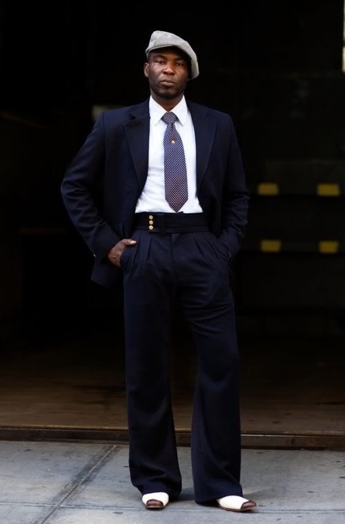
..... it came from the same site. Check this guy out.
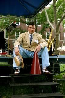
boater.jpg


Regards,
J.S.
 

resortes805

Call Me a Cab
Messages
2,019
Location
SoCal
undertaker said:

OK, now w'ere talkin'! In my opinion, this looks cool. As in the other picture, you really can't tell much about the fit due to the pose, but it does'nt really matter; his ensemble is well put together (white socks and all!), while the other guy's outfit is . . .lacking.
 

Tomasso

Incurably Addicted
Messages
13,719
Location
USA
I just don't get the level of animosity directed at the first subject by the members here. It's truly stunning; You'd think he were wearing Thom Browne. :eusa_doh:
 
I have to agree, Tomasso. We can't say anything about the cut of jacket due to the sloppy pose. But to my eyes the waistcoat appears well done, and relatively high waisted trousers, British pleats? Shirt and tie no good. Bad choices. But the suit itself - the bits we can critique - looks like a winner.

I'm not a fan of the showy watch-chain though.

bk
 

metropd

One Too Many
Messages
1,764
Location
North America
I personally like the whole presentaion. I would just not wear a widespread collar if I had the fullness of his face because It is only emphasizing it more. Otherwise I like the shirt and tie combo with the suit. I don't know why some people are so critical. He looks better than just about every buisness man you see on the street.
 

resortes805

Call Me a Cab
Messages
2,019
Location
SoCal
Tomasso said:
I just don't get the level of animosity directed at the first subject by the members here. It's truly stunning; You'd think he were wearing Thom Browne. :eusa_doh:

OK, I'll admit it. I am a little envious of the deadstock fabric. In my opinion, he had a wonderful opportunity and he blew it; there are just so many more interesting things that he could have done with it. I'm sure, he's happy with the finished product, so more power to him, but maybe he should of taken it to Michele Savoia!
 

resortes805

Call Me a Cab
Messages
2,019
Location
SoCal
OK, I'm a fan of the cocked cap; the waistband and the overall fit of the trousers; but the fabric seems a little off. Plus he really needs some creases and cuffs to accentuate the wide bottoms. The jacket does not seem that great though.
 

MudInYerEye

Practically Family
Messages
988
Location
DOWNTOWN.
^
Tough crowd, you guys.
That dude looks 85% better than 95% of the guys who post photos of their "fits" here. Granted it's not a perfect reproduction of suit from 1935 but who gives a toss? It works.
 

BellyTank

I'll Lock Up
It works, as a whole, yes, a good effort and a nice change from usual contemporary mediocrity but that deep waistband would definitely look a lot better with a higher rise. I think it looks a bit awkward as it is.
I'm not thinking a bout the vintage look, so much as the general look of the trousers.


B
T
 

thunderw21

I'll Lock Up
Messages
4,044
Location
Iowa
I like the look but I agree with BellyTank, a couple more inches north would work and would get the cuffs off the ground, help 'em last longer.
 

Forum statistics

Threads
109,310
Messages
3,078,571
Members
54,243
Latest member
seeldoger47
Top