Want to buy or sell something? Check the classifieds
  • The Fedora Lounge is supported in part by commission earning affiliate links sitewide. Please support us by using them. You may learn more here.

Art Fawcett VS Hall of Fame

mikespens

Call Me a Cab
Messages
2,913
Location
Tacoma, Wa
Thanks Mike, like I said before, the concept was all Art's. He mentioned something OR like and when I spec'd the brim length guess he change his mind. Always wanted a Strat!
 

Landman

One Too Many
Messages
1,751
Location
San Antonio, TX
Mike, there is not much difference between an OR and a Strat except the name on the sweatband. Same bow on both. I've never seen a blue OR though but have seen some blue gray Strats. Whatever the inspiration, it turned out great!
 

mikespens

Call Me a Cab
Messages
2,913
Location
Tacoma, Wa
Thanks Jared and David, I have no doubt either of you could wear the color though, it's surprisingly friendly. Think it has a lot of possible combinations with, grays, browns, and even black. Not to mention blue! Art told me he had a pinkish/tan ribbon he thought would go well with the Powder blue, the thought of that was shocking! His taste is impeccable though I think it turned out great.
 

1961MJS

My Mail is Forwarded Here
Messages
3,370
Location
Norman Oklahoma
Hi Mike

I'd be scared to wear that powder blue. The picture of the hat vibrates on both my home and work laptops, but the picture of you wearing the same hat looks fine. I'm hard enough to look out with vibrating...

Later
 

Rabbit

Call Me a Cab
Messages
2,561
Location
Germany
Mike (1961), the Powderblue felt looks more subdued in person. I bet the same goes for the peach-toned ribbon which, in accordance with the felt dye, is a pastel shade.

Here's a Powderblue of mine in fairly accurate color rendition. The ribbon on this one is a 22 ligne midnight blue - a true midnight blue that looks nearly black in artificial light and in the shade, and very dark blue in direct sunlight. The binding is silver.

P1060633.jpg
 

casechopper

My Mail is Forwarded Here
Messages
3,783
Location
Northern NJ
I'm wearing my powderblue VS today and I think the color on my photos is pretty close to the actual color as well. I'll add a photo here to add another view alongside the much nicer photo that Rabbit has posted.
IMG_4461.JPG

The color does look different under different lights. It appears more blue in dark light conditions and lighter blue in bright light.
IMG_8741.JPG
 
Last edited:

Rabbit

Call Me a Cab
Messages
2,561
Location
Germany
Powderblue is not a color that I thought that I would wear, but in good lighting the powderblue VS hats look good.
It's not a conservative color, but it has its place. It does look less conspiciuous than one might think from seeing the felt samples. In high contrast lighting, it can look surprisingly similar to a light bluish gray. In low contrast, it's the pastel tone that makes the look.
 

mikespens

Call Me a Cab
Messages
2,913
Location
Tacoma, Wa
Congrats to Jauntyone for his place on the VSCOM (another useless acronym!).

Agree with what Nik is pointing out and casechopper's example, the Powder blue is less intimidating(?) in person than it may appear in the pixs or the sample sheet. I'm certainly conservative in my fashion sense, if I have any at all, and think it's more natural than first appears. After all, anybody wearing a brimmed hat these days is going to stand out to an extent regardless of it's color. Certainly glad Art offers so many color choices though.
 

Rabbit

Call Me a Cab
Messages
2,561
Location
Germany
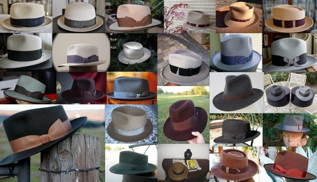
26 VS colors

For all the wonderful photos of VS felts posted in this thread over the years, I'm saying thank you to all of you. This thread has helped me a great deal in visualizing my own VS designs.

The collage features VS hats in all felt colors from Art's inventory, photographed by other Loungers. Hope you like it. See the full resolution image for more details.

VSs_from_other_Loungers1100px.jpg


Full resolution image

In the six columns:

1st column:

Mojave-w-navy
Ivory-w-greenishcharcoal
LightSage-w-charcoal
DarkMoss-w-pastelorange (the large pic)

2nd column:

Sand-w-greenishgrey (felt color discontinued)
Silvermist-w-purplesilver
BlackCherry-w-tonal
...and again the large pic of the Dark Moss

3rd column:

Sahara-w-dkmocca
Silverbelly-w-tonal
Midnite-w-tonal
Pecan-w-greyish
Forest-w-tonal

4th column:

Natural-w-dustypink
Dove-w-black
Oxblood-w-tonal
Whiskey-w-dkbrown

5th column:

Camel
BlueSmoke-w-bluish
Charcoal-w-dkbrown
Black-w-black
Rust-w-dkrust

6th column:

Sunset-w-blackcherry
Powderblue-w-midnightblue
Steel-w-charcoal (with Blue Smoke to the right)
Granite-w-grey
Chocolate-w-copper
 
Last edited:

bowlerman

I'll Lock Up
Messages
6,294
Location
South Dakota
Nik. You are awesome. Now THAT is a catalog.

Hey Mike-- do you have a shot of what your new powder blue looks like from the top/back? The crease piques my interest.
 

Forum statistics

Threads
109,295
Messages
3,078,184
Members
54,244
Latest member
seeldoger47
Top