Want to buy or sell something? Check the classifieds
-
The Fedora Lounge is supported in part by commission earning affiliate links sitewide. Please support us by using them. You may learn more here.
You are using an out of date browser. It may not display this or other websites correctly.
You should upgrade or use an alternative browser.
You should upgrade or use an alternative browser.
Vintage Phonebooks
- Thread starter Yeps
- Start date
ginfizz
One of the Regulars
- Messages
- 137
- Location
- Philadelphia
Who are you in Our Town? I was in that play once!
http://www.oldtelephonebooks.com/pbcoll.html
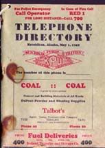
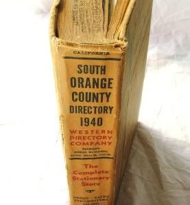

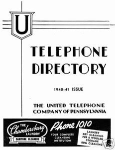
I don't know if any of this helps, but this is what I found.
http://www.oldtelephonebooks.com/pbcoll.html


I don't know if any of this helps, but this is what I found.
Last edited:
LizzieMaine
Bartender
- Messages
- 33,738
- Location
- Where The Tourists Meet The Sea
Most Bell System directories used the same general cover design -- an image of the "Spirit Of Communication".

Big urban directories might feature a fancier cover -- I have a copy of the 1944 Manhattan Yellow Pages with an elegant full-color painting of a Liberty ship on the front between bright red borders -- but most run-of-the-mill Bell System books used the above cover from the early thirties to the early fifties. Independent phone companies could use any design they wanted, but most of these tended to be print-heavy with ads and such on the front instead of elaborate artwork.

Big urban directories might feature a fancier cover -- I have a copy of the 1944 Manhattan Yellow Pages with an elegant full-color painting of a Liberty ship on the front between bright red borders -- but most run-of-the-mill Bell System books used the above cover from the early thirties to the early fifties. Independent phone companies could use any design they wanted, but most of these tended to be print-heavy with ads and such on the front instead of elaborate artwork.
- Messages
- 10,883
- Location
- Portage, Wis.
The ones I typically see look like Lizzie's example. Good ol' Ma Bell.
ginfizz
One of the Regulars
- Messages
- 137
- Location
- Philadelphia
Good luck with it! It's such a fun show.
Featured products
-
 Alden 403 Moc Toe Boot - Brown Chromexcel - $680 The classic "Indy" style Alden Boot in the classic Horween brown Chromexcel.
 -
 Grant Stone Diesel Boot Dark Olive Chromexcel - #395 Goodyear welted, Horween Chromexcel, classic good looks.
 -
 Himel Bros. - The Ross Mk. 1 Leather Jacket Classic D-pocket motorcycle/aviator style jacket.
Similar threads
- Replies
- 6
- Views
- 2K
Members online
- realgone
- AeroFan_07
- Craig from Craigslist
- Breath
- voodootomato
- EuroCool
- stephenyi
- Grasp loo paper
- Monitor
- BaslerChrysler
- DonR
- MickeyPunch
- Raisin Brando
- TartuWolf
- Ventoux
- Khilij
- Kuhl-One
- Seank
- BloodEagle
- Bruno
- Iskandaros
- Johnny Deadlifts
- 3fingers
- jchance
- Frunobulax
- Shawnziee
- rogueclimber
- Maso
- Kalmer
- Modified_last_call
- red devil
- fengz
- spoonbelly1950
- Cepice
- sgt pepper
- zanesvilleil
- Kunja
- tuanhng614
- Mikeyrens
- Trenchfriend
- BDL
- Daniele Tanto
- navetsea
- Guppy
- Fading Fast
- frogbart123
- Tom71
- Hiufoundmee
- heavydutysg135
- The Shoe
Total: 2,456 (members: 79, guests: 2,377)