So having got the design mapped out in white acrylic paint as a base, now we move on to adding the colours ...
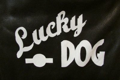
So this is as far as we got from the last time and now we are ready to proceed with colours.
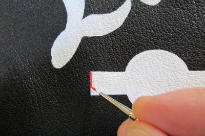
So now I add some Cadmium Red Deep for the border ...
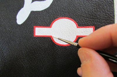
With a steady hand, that's completed.
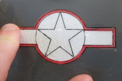
Then overlay and check your stencil to reference that you kept everything neat and the border has an equal width and is proportioned just as you intended and designed.
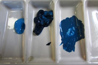
To get the blue colour I wanted, I mixed some Indianthrene Blue with some Brilliant Blue (with Flow Improver of course) and adjusted it until it was the shade I wanted (right) - then I applied it in the spaces of the USAAF emblem according to the stencil.
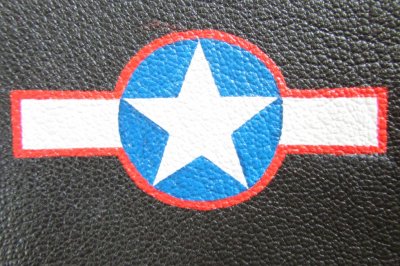
Et voila, adding the blue forms the star.
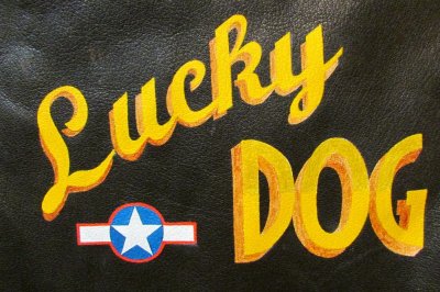
So then I applied a light coat of the colours I'd chosen for Lucky Dog - namely the Cadmium Yellow Deep plus Burnt Sienna - and I do this to put a base coat of colour down, but also, so I can review the colours to decide if I like them as much as I thought I would ...
Hmmm....

Hmmmm.... and I'm thinking "not quite" at this point.
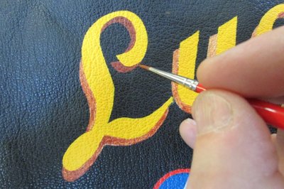
Then I add a second coat of Burnt Sienna to be sure and, over the first coat, suddenly the colour has opacity and starts to work, but I'm not liking it. I'm thinking that it's too dark for a drop-shadow and won't be as apparent as I'd hoped, being too subdued on the dark leather background - especially when it's "aged" and darkened too.
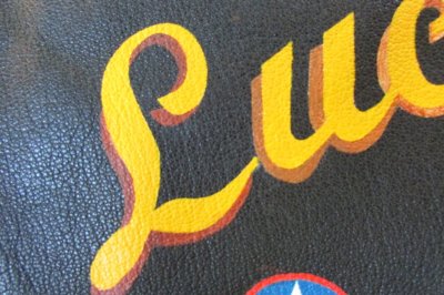
So I complete the L in Burnt Sienna, but I do the U in Raw Sienna - to compare the two against each other ...
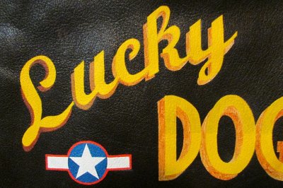
I prefer the Raw Sienna! And that's the beauty of the acrylic paints - made a mistake? Paint over it!
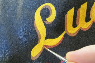
So then I paint Raw Sienna over the Burnt Sienna ...
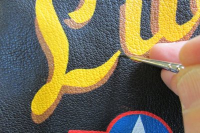
Working inwards with a little Mars Black/Dark Umber to make the edges really neat.
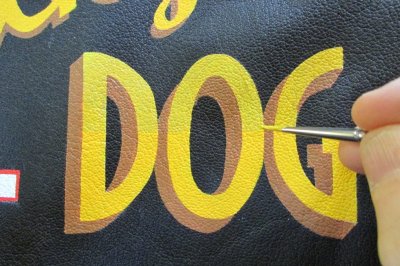
A little bit of Turner's Yellow over the Cadium Yellow Deep to accent the upper half of DOG a la "Shack Rabbit".
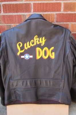
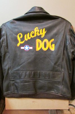
And then the colours are done! Here it is outside (and the art looks a lot brighter than it actually is!).
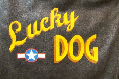
But of course, I know what you're thinking - it looks very new and fresh - not vintage at all. Very true and it's really not what we're after ... yet.
So next we'll add some dark washes and "age" and "weather" the art and really tone it down and make it go from that ...
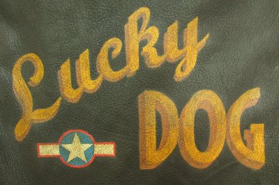
To this … and how we do that will be covered in the next - and final - instalment of the process.
We're nearly there - and we're on the home straight …!
End of Part 7.

So this is as far as we got from the last time and now we are ready to proceed with colours.

So now I add some Cadmium Red Deep for the border ...

With a steady hand, that's completed.

Then overlay and check your stencil to reference that you kept everything neat and the border has an equal width and is proportioned just as you intended and designed.

To get the blue colour I wanted, I mixed some Indianthrene Blue with some Brilliant Blue (with Flow Improver of course) and adjusted it until it was the shade I wanted (right) - then I applied it in the spaces of the USAAF emblem according to the stencil.

Et voila, adding the blue forms the star.

So then I applied a light coat of the colours I'd chosen for Lucky Dog - namely the Cadmium Yellow Deep plus Burnt Sienna - and I do this to put a base coat of colour down, but also, so I can review the colours to decide if I like them as much as I thought I would ...

Hmmm....

Hmmmm.... and I'm thinking "not quite" at this point.

Then I add a second coat of Burnt Sienna to be sure and, over the first coat, suddenly the colour has opacity and starts to work, but I'm not liking it. I'm thinking that it's too dark for a drop-shadow and won't be as apparent as I'd hoped, being too subdued on the dark leather background - especially when it's "aged" and darkened too.

So I complete the L in Burnt Sienna, but I do the U in Raw Sienna - to compare the two against each other ...

I prefer the Raw Sienna! And that's the beauty of the acrylic paints - made a mistake? Paint over it!

So then I paint Raw Sienna over the Burnt Sienna ...

Working inwards with a little Mars Black/Dark Umber to make the edges really neat.

A little bit of Turner's Yellow over the Cadium Yellow Deep to accent the upper half of DOG a la "Shack Rabbit".

And then the colours are done! Here it is outside (and the art looks a lot brighter than it actually is!).

But of course, I know what you're thinking - it looks very new and fresh - not vintage at all. Very true and it's really not what we're after ... yet.
So next we'll add some dark washes and "age" and "weather" the art and really tone it down and make it go from that ...

To this … and how we do that will be covered in the next - and final - instalment of the process.
We're nearly there - and we're on the home straight …!
End of Part 7.
Last edited:
