Brad Bowers
I'll Lock Up
- Messages
- 4,187
A Caveat: For this review, I was interested to see what HATCO had done with the new Cavanagh line, but very hesitant at the same time. After all the research I’ve done on John Cavanagh and his contributions to the hat-making industry, I feel just a little protective of the name. I decided to jump in with both feet and see the latest offering. What follows is my opinion only, and no one else’s.
The Review:
2007 marks the rebirth of the Cavanagh name as a hat brand, brought back to us from the retail afterlife by HATCO. It’s exhilarating to see the Cavanagh name come back, but it remains to be seen what how successful it will be in the marketplace. Without having perused any of HATCO’s marketing material for Cavanagh, it’s hard to tell how they will differentiate it from their other brands, if at all.
The hat under review is the “Park Avenue,” HATCO’s top of the line Cavanagh. The itself name harkens back to Cavanagh’s exclusive store at 247 Park Avenue in New York City.
For the photos, I did not alter the shape of the hat as it came out of the box. What you see is what you get, and I’ll let the photos speak for themselves.
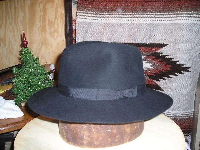
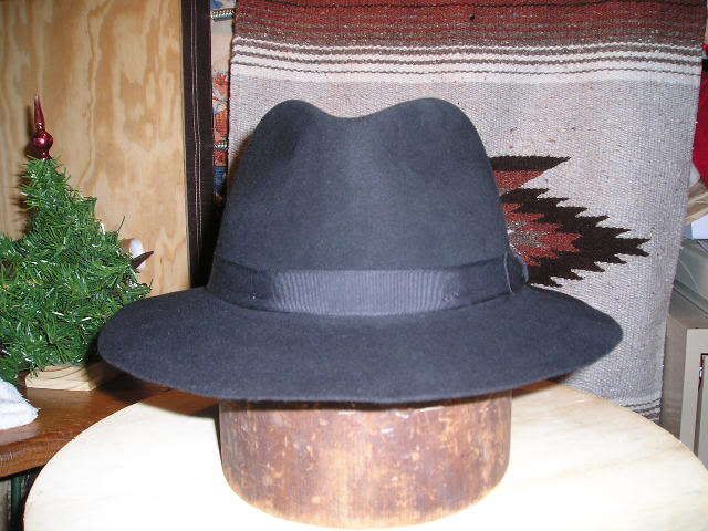
The felt is very nice for a production hat. Touted as “Genuine Beaver” (does that mean 100%?), it has a soft, even finish, smooth but with a short nap that gives it a hint of luxury. The crown has a thumpable firmness to it, and can be shaped, grudgingly, by hand. A little steam would work better, though. The brim, however, has very little stiffener, and can easily develop a wavy appearance.
The brim has a dimensional cut, 2 ¬?‚Äù front and back, 2 ¬º‚Äù on each side. It has been flanged into a downturned brim with no snap, so anyone wanting to flip up the back will have to get the brim reflanged.
The black sweatband is 1 5/8” wide soft leather, either roan or calfskin, and one of the nicer sweatbands I have seen on a modern production hat. The Cavanagh name is stamped onto the left side in gold, and “Genuine Beaver” is stamped onto the front, along with the ubiquitous gold line along the top edge that’s to be expected on modern hats.
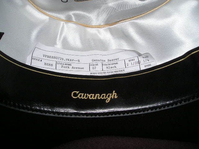
The liner is white, with champagne-colored piping around the tip. I may be wrong , but the black, and perhaps the red, parts of the artwork appear to have been applied using the sublimation process, a relatively inexpensive method where the art is printed on paper and transferred to the liner tip. The effect looks more like the artwork was photocopied onto the cloth than actually printed, giving a washed out look to the black lines, and results in a loss of fineness of detail. The gray and gold paint were applied as a separate process, perhaps by silkscreen. The overall look mimics that of the time-honored Cavanagh liner, but is more of an imitation than a continuation. The liner is spot-glued into the hat, not sewn. Thankfully, there is no plastic liner tip protector.
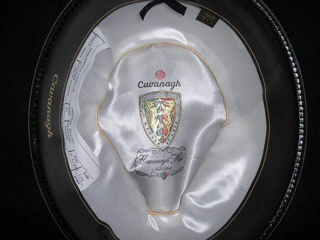
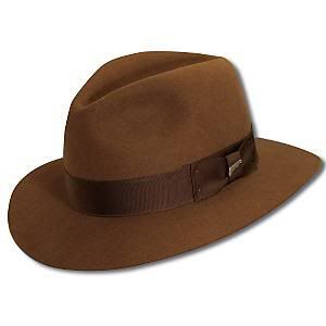
I don’t find the block of the hat that appealing. My general opinion of the aesthetics of the hat is colored by the fact that the hat is not a style I prefer. The crown is low, only 5” when punched out to an open crown. It comes from the factory with a shallow center dent and front pinches. Because the crown is so short and tapered, it isn’t helped a lot by giving it a diamond crease or a C-crown.
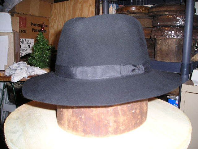
It has a 9-ligne (about 13/16”), black, grosgrain ribbon. While the bow is nicely done, the ribbon is tacked is in six places with monofilament line, smackdab in the middle of the ribbon, rather than on the edges where it should be.
The original Cavanagh Hats included every variety of hat imaginable, and subsequently, the name has become with synonymous with quality and class. One would naturally expect a newly-reborn Cavanagh to exude formality and class. For the flagship of the Cavanagh line, however, the Park Avenue just seems too casual, not dressy enough to reflect the Cavanagh name. To me, it has more of the appearance of a gussied-up Aussie Outback hat.
Then again, maybe by current standards this is a very dressy and formal hat, and I’m just hopelessly outdated.
Kudos to HATCO for bringing back one of the most-honored names in hats. I’d like to see them do more to differentiate the Cavanagh line from their other brands, and I’d prefer to see them go more formal and traditional, but only time will tell whether this revival will be long lasting or short lived.
Brad
The Review:
2007 marks the rebirth of the Cavanagh name as a hat brand, brought back to us from the retail afterlife by HATCO. It’s exhilarating to see the Cavanagh name come back, but it remains to be seen what how successful it will be in the marketplace. Without having perused any of HATCO’s marketing material for Cavanagh, it’s hard to tell how they will differentiate it from their other brands, if at all.
The hat under review is the “Park Avenue,” HATCO’s top of the line Cavanagh. The itself name harkens back to Cavanagh’s exclusive store at 247 Park Avenue in New York City.
For the photos, I did not alter the shape of the hat as it came out of the box. What you see is what you get, and I’ll let the photos speak for themselves.


The felt is very nice for a production hat. Touted as “Genuine Beaver” (does that mean 100%?), it has a soft, even finish, smooth but with a short nap that gives it a hint of luxury. The crown has a thumpable firmness to it, and can be shaped, grudgingly, by hand. A little steam would work better, though. The brim, however, has very little stiffener, and can easily develop a wavy appearance.
The brim has a dimensional cut, 2 ¬?‚Äù front and back, 2 ¬º‚Äù on each side. It has been flanged into a downturned brim with no snap, so anyone wanting to flip up the back will have to get the brim reflanged.
The black sweatband is 1 5/8” wide soft leather, either roan or calfskin, and one of the nicer sweatbands I have seen on a modern production hat. The Cavanagh name is stamped onto the left side in gold, and “Genuine Beaver” is stamped onto the front, along with the ubiquitous gold line along the top edge that’s to be expected on modern hats.

The liner is white, with champagne-colored piping around the tip. I may be wrong , but the black, and perhaps the red, parts of the artwork appear to have been applied using the sublimation process, a relatively inexpensive method where the art is printed on paper and transferred to the liner tip. The effect looks more like the artwork was photocopied onto the cloth than actually printed, giving a washed out look to the black lines, and results in a loss of fineness of detail. The gray and gold paint were applied as a separate process, perhaps by silkscreen. The overall look mimics that of the time-honored Cavanagh liner, but is more of an imitation than a continuation. The liner is spot-glued into the hat, not sewn. Thankfully, there is no plastic liner tip protector.

I don’t find the block of the hat that appealing. My general opinion of the aesthetics of the hat is colored by the fact that the hat is not a style I prefer. The crown is low, only 5” when punched out to an open crown. It comes from the factory with a shallow center dent and front pinches. Because the crown is so short and tapered, it isn’t helped a lot by giving it a diamond crease or a C-crown.

It has a 9-ligne (about 13/16”), black, grosgrain ribbon. While the bow is nicely done, the ribbon is tacked is in six places with monofilament line, smackdab in the middle of the ribbon, rather than on the edges where it should be.
The original Cavanagh Hats included every variety of hat imaginable, and subsequently, the name has become with synonymous with quality and class. One would naturally expect a newly-reborn Cavanagh to exude formality and class. For the flagship of the Cavanagh line, however, the Park Avenue just seems too casual, not dressy enough to reflect the Cavanagh name. To me, it has more of the appearance of a gussied-up Aussie Outback hat.
Then again, maybe by current standards this is a very dressy and formal hat, and I’m just hopelessly outdated.
Kudos to HATCO for bringing back one of the most-honored names in hats. I’d like to see them do more to differentiate the Cavanagh line from their other brands, and I’d prefer to see them go more formal and traditional, but only time will tell whether this revival will be long lasting or short lived.
Brad
